[ad_1]
If you have a question for Luke about design and stylish living, email him at lukeedward.hall@ft.com. Follow him on Instagram @lukeedwardhall
I have grown very bored of the wooden floor in my drawing room. I’d love to put down some rugs, or even fit a new patterned carpet. Any thoughts?
Choosing the right rug is tricky. I know that many people, designers included, like to build entire rooms around rugs, basing everything on their colours. But this has never really appealed to me. When decorating, I tend to begin by choosing a wall colour or wallpaper, then fabrics, furnishings and lighting, followed by artwork and, last, a rug.
Don’t get me wrong, I love them. But I usually have a lot going on in my rooms — many colours and patterns — and rugs need to work with everything else. For that reason, I like letting a room settle for a moment before adding this final element. At the risk of sounding like Jeff Bridges in The Big Lebowski: the right rug can really tie a room together.
Sometimes I may have so much going on in a room that, actually, the rug just wants to be neutral — this was the case when it came to decorating
the sitting room/foyer at the hotel I worked on in Paris last year. In this space, we installed a black and white marbled chevron floor, electric pea-green panelling to waist height and pale blue and brown toile de Jouy wallpaper above.
The rug, therefore, needed to be fairly plain, something that wouldn’t fight with everything else. I went with my old favourite: seagrass squares. These are incredibly cheap and come in 30cm x 30cm panels. You get them sewn together, which means any size is possible. This kind of matting works with anything and everything, and I love its rough texture and faint diamond pattern. (Check eBay — I source my seagrass from a seller called Toms Originals.)

If rough-to-the-touch and beige doesn’t appeal, consider something
old: I have several dealers that I often return to for rugs. Retrouvius, for example, often has a good stock of textiles including, currently, a piece of north African fabric in cerise and mint green stripes. This would look superb in a room with white walls.
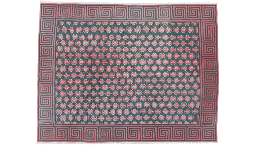
I love a dhurrie, too. These heavy cotton rugs are of Indian origin and tend to feature flowing, stylised motifs, whereas kilims are usually more geometric in design. (Both are flat woven rugs.) The London-based dealer Guinevere always has a fantastic range of dhurries on offer. At the moment, I’m besotted with a green and red number with a blossom motif and Greek key border, woven in Uttar Pradesh circa 1910.

The issue with old rugs is that often I will fall in love with a design, before discovering that the size is completely wrong. Sometimes it is better, necessary even, to have a new rug made to the exact size you need.
Luke Irwin, king of the hand-knotted rug, produces hundreds of designs and has made rugs for all kinds of beautiful shops and restaurants, from Bergdorf Goodman to the Gritti Palace. Generally, I’m drawn to the brand’s bolder, more colourful rugs: its black and white geometrics, blown-up ikats and, in particular, one beautiful plain Berber, the colour of bright red flamingo feathers.
I am a major fan of fitted carpets in daring patterns, too. I don’t base my room designs around rugs, but I contradict myself: in the Paris hotel,
I knew early on that I wanted to use a geometric carpet in the upstairs corridors, inspired by my hero David Hicks, an undisputed genius in the realm of bold, geometric carpets. I chose a design from Wilton, the renowned manufacturer situated in the Wiltshire town of the same name.
Much later on I selected paint colours for the walls, because this part wasn’t as important; the carpet design is integral to the corridors, it’s the
main event. (See, of course, the famous hexagonal carpet in the Overlook Hotel in Stanley Kubrick’s The Shining, which is a copy of a David Hicks design.) I can’t recommend enough exploring Wilton’s extensive archive of designs via its online design hub: you’ll get lost down a rabbit hole.

See also Paris’s Codimat. I love its geometric and baroque styles, but most of all the reissues of carpet designs by legendary French decorator Madeleine Castaing. My favourite is Vauban, which feels like a 1960s space-age take on a traditional trellis design.
House & Home Unlocked
FT subscribers can sign up for our weekly email newsletter containing guides to the global property market, distinctive architecture, interior design and gardens.
Last, consider animal print carpet. After all, leopard is neutral. This is actually quite a commonly held belief, and it’s true — the neutral brown and beige tones will work with a range of brighter and paler colours, as well as other patterns such as stripes and florals. Like seagrass, it’ll go with everything.
We have leopard print carpet in our bedroom at home in London and I have to say it took months to find the right version when we installed it almost four years ago. (I wanted more of a straw-toned background, nothing too orangey.)
We settled on a very elegant ocelot design from a company called Ollerton — when the fitter came to install it, he said he hadn’t done an animal print carpet since the 1980s. Cheers to that!
Follow @FTProperty on Twitter or @ft_houseandhome on Instagram to find out about our latest stories first. Listen to our podcast, Culture Call, where FT editors and special guests discuss life and art in the time of coronavirus. Subscribe on Apple, Spotify, or wherever you listen.
[ad_2]
Source link


